Case Study · 03 / 03
Rebuilding Domino's KSA around hierarchy, not a wall of buttons
The app takes the order. The opportunity is a clearer path: what to tap first, then pick, then track.
Context
An ordering app that gets the job done, with a chance to make every step obvious
Domino's Saudi Arabia's app will take your order. The chance is telling you what matters first: today's deal, food you can add, and tracking you can find without hunting.
I designed this independently in Figma, from the live app. I kept Domino's red, the Arabic-first layout, and the real menu content so the before is recognizable and the after is easy to judge.
As the designer on this, I:
- Audited the live Home, the side drawer, and the menu list
- Rebuilt the order flow around three screens: discover, pick, track
- Kept Domino's red, the Arabic-first layout, and the real menu content
- Designed the screens in Figma as a high-fidelity prototype
The Problem
Every action looks as important as every other action
-
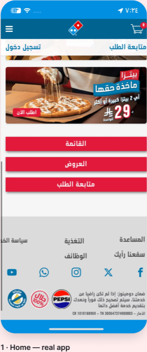
No visual hierarchy on Home
Menu, offers, track order, change country, they all read at the same weight. Nothing tells a first-time visitor what to tap. The deal, which is usually why someone opened the app, is just another banner above a button stack.
-
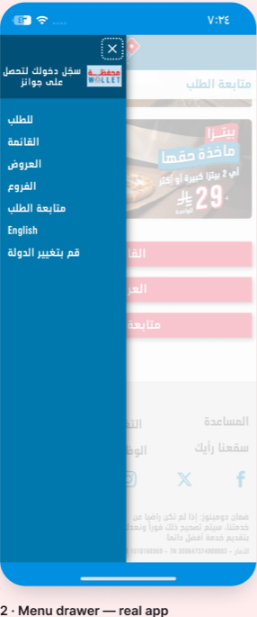
Tracking lives in a drawer
Core actions like tracking an order or browsing the menu sit behind a hamburger. That adds a tap and a moment of uncertainty to the most anxious moment in the whole flow: "where's my pizza?"
-
A menu you have to read
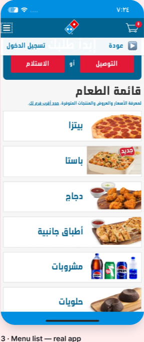
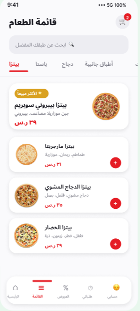
Categories are a stacked list of names and small squares. Nothing groups by what you actually want, and nothing lets you add from the list. You scan every row instead of grabbing the thing you came for.
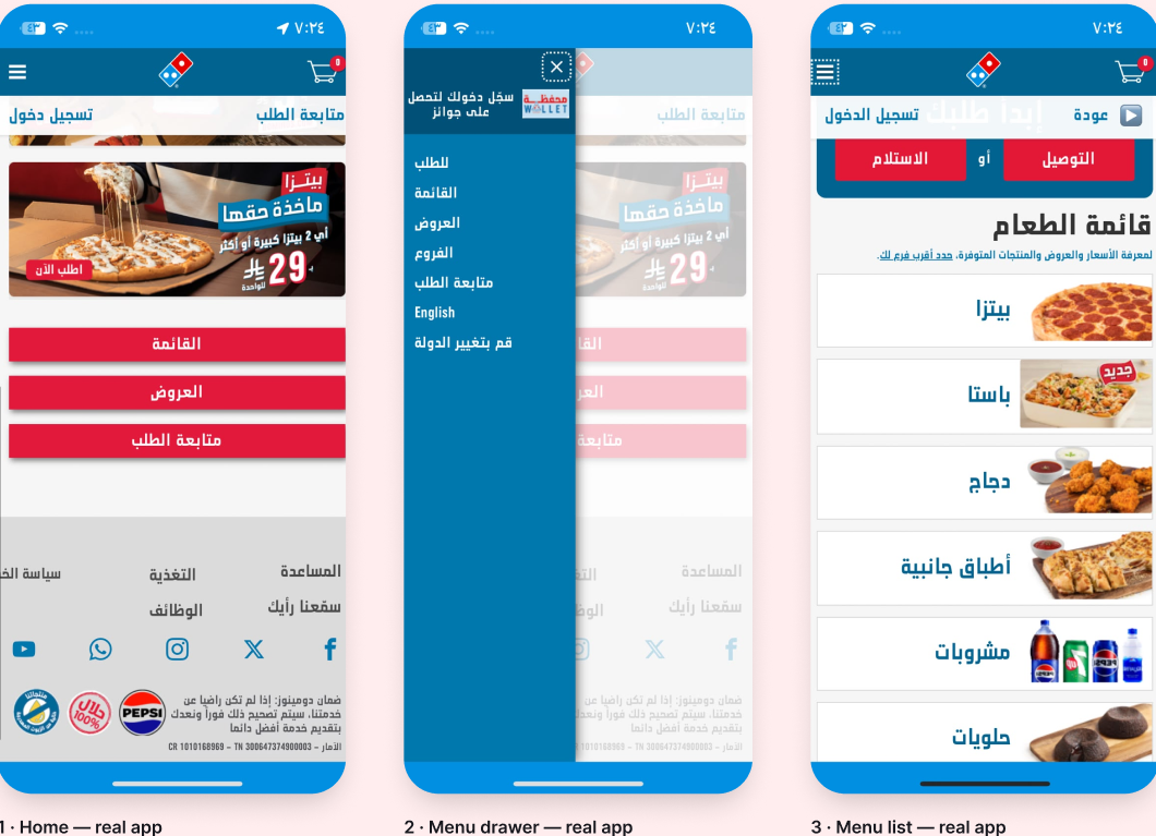
Before, the live app: Home, drawer, menu list
Insights
What I noticed using the real app
A screen-by-screen audit of the live app: where the first tap is unclear, and what the order flow actually needs.
The deal is why people open the app
Today's offer shouldn't be one more banner above a button stack. It should be the first thing on screen, then a way to start ordering without hunting for Menu.
Categories, not a list of labels
Pizza, pasta, chicken, drinks, people already think in these. A flat list of names makes them read. A product grid with a photo, a price, and an add button lets them scan.
Tracking is a check-in, not a lookup
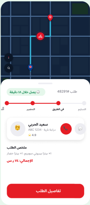
People open a food app mid-order just to see where it is. A drawer, then a form, then a status is the wrong shape. They want a map, a time, and a name they can call.
Process
Three screens that match the real job: discover, pick, track
Solution
Discover, pick, track, each screen does one of those
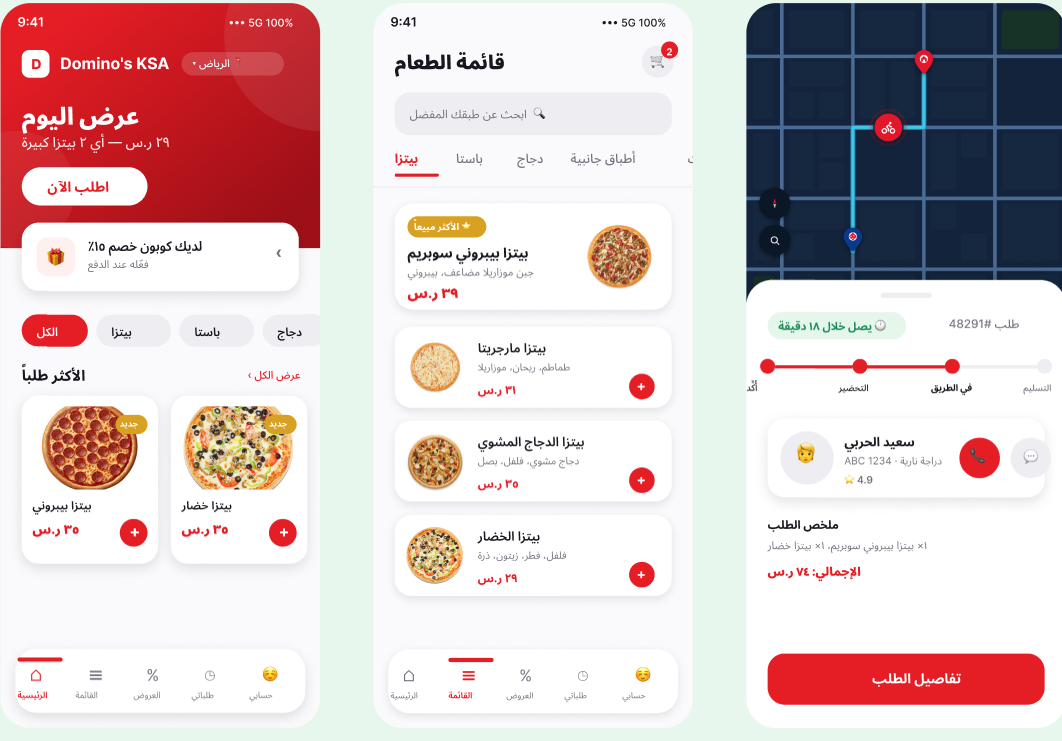
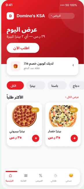
Home: the deal, then food you can add
Today's offer leads. Category chips sit under it. "Most requested" is a two-up grid with photo, price, and a plus, not a button that says Menu.
- Before
- Stacked full-width buttons. Same weight for menu, offers, and track.
- After
- Deal first. Then a product grid. Tracking has its own tab.
Menu: cards you can act on
Search at the top. Category chips. A featured "most popular" item, then a list with thumbnails, a short line of copy, a price, and add. You never leave the list to start an order.
- Before
- A stacked list of category names and tiny squares.
- After
- Dishes, not labels, photo, price, add, in one glance.
Tracking: a map and a person, not a form
A route, an ETA, a four-step status, the driver's name and plate, call and message. Order summary underneath. This is the screen people open when they're hungry and impatient, it has to answer without another tap.
Outcome
Home leads with the deal, then food you can add. The menu is dishes with a price and a plus. Tracking is a map, an ETA, and a driver you can call, not a drawer.
A high-fidelity concept in Figma, three screens for discover, pick, and track.
Reflection
What I'd do next
- Test Home with people who order Domino's here, then take the same hierarchy through checkout and the cart.
- Keep deal, dish, and driver as the three jobs, every new screen should serve one of them.
Key learning
The opportunity wasn't more features. It was a point of view about what to tap first: deal, dish, driver.
Other projects
Got something like this to design?
I'd rather talk it through than read a brief.