Case Study · 02 / 03
Cutting the noise in the stc app so balance, store, and Qitaf can actually lead
People open it to check a number, buy something, or spend points, Home should lead with those jobs.
Context
Everyone in Saudi has this app. People open it for three jobs: balance, store, and Qitaf.
stc is the country's main telecom. The app has to do three jobs well: show me my balance, let me buy a package or a device, and let me use Qitaf points. Everything else is secondary, and on the live Home screen, those extras compete with the jobs people came for.
I designed this independently in Figma. I kept stc purple, Qitaf's identity, and the existing four tabs. The work was subtracting: one primary action per screen, consistent buttons, and a More menu that groups instead of dumping.
As the designer on this, I:
- Audited Home, Store, Qitaf, and More in the live app
- Listed every CTA on Home and ranked them by how often a prepaid user would actually need them
- Redesigned the four screens in Figma without inventing a fifth tab
- Treated Qitaf as part of stc, not a mini-app glued onto the side
The Problem
Too many things asking to be tapped first
-
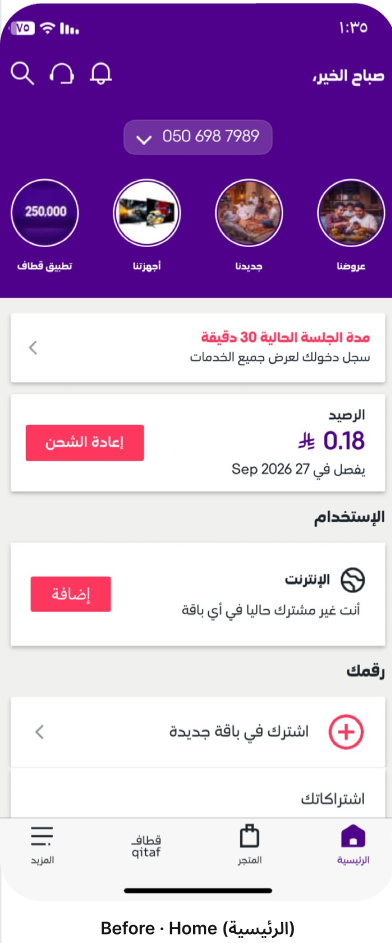
Home is a pile of competing CTAs
Greeting, number picker, Qitaf shortcut, offers, new items, a session-duration alert, balance, usage, and "subscribe to a plan" all sit in the first scroll. Nothing tells you which one is the reason you opened the app.
-
Buttons don't agree with each other
Red recharge, green SIM, teal home internet, pink add, purple transfer. When every action is a different color, none of them is primary.
-
Qitaf and More need a clearer structure
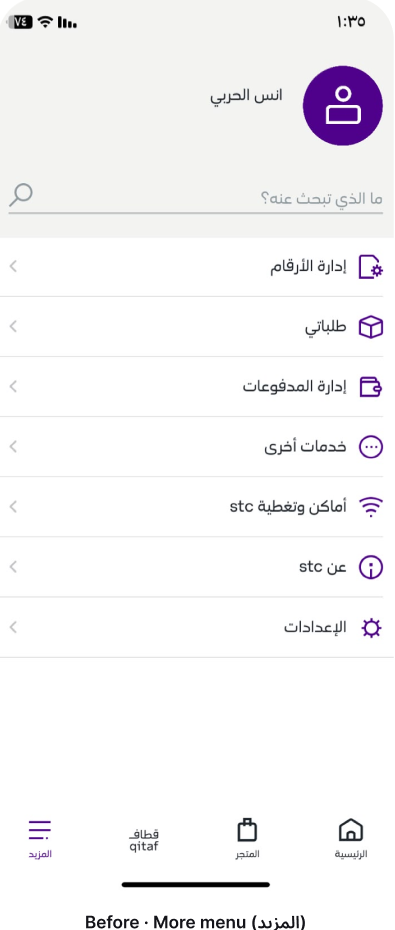
Qitaf already has a strong identity, but the screen still reads as a stack of banners. More is a flat list, manage numbers, orders, payments, coverage, about, settings, with no grouping, so a task you do weekly sits next to a task you do once.
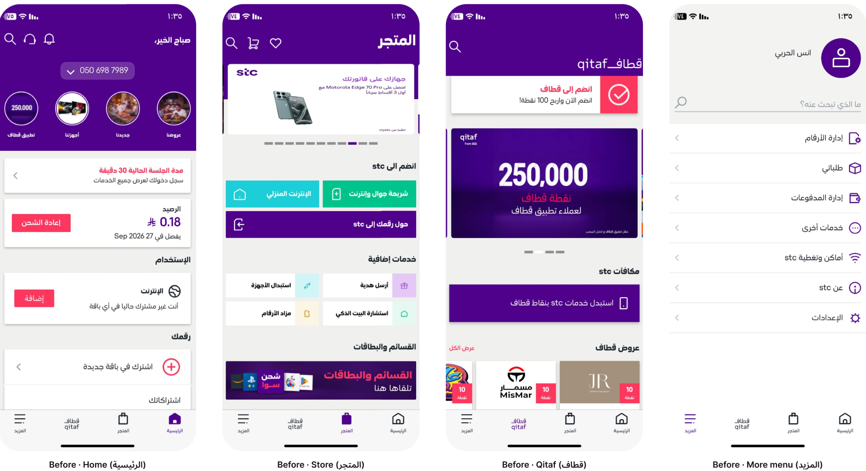
Before, the live app, same four screens
Insights
What the live app is actually used for
A close audit of the live app, plus the usage pattern of a prepaid line: open, check, recharge or subscribe, leave.
Balance is the homepage
People don't open stc to browse. They open it to see if they still have credit, and then maybe recharge. That card should be the first thing that isn't the greeting.
One primary per screen
Home's job is remaining balance + recharge / subscribe. Store's job is joining stc or buying a device. Qitaf's job is "how many points, and can I spend them." If a screen has four primaries, it has none.
Qitaf needs a status, not a poster
Points without a tier, a progress bar, or a single redeem action are just a big number. Loyalty only works if you can see where you stand and what to do next.
More should group, not alphabetize by accident
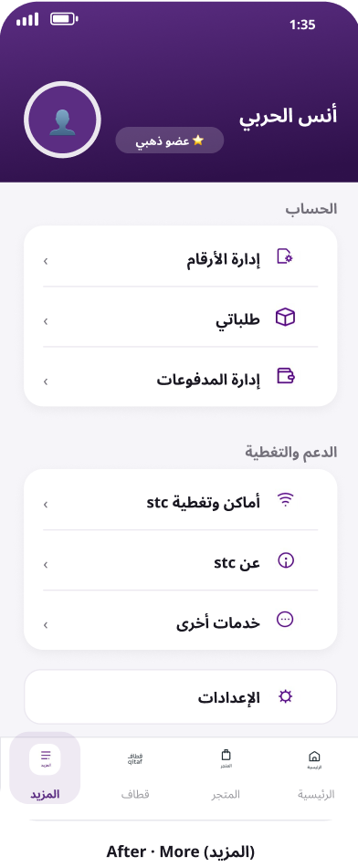
Account tools, support, and settings are three different jobs. Mixing them in one list makes every visit a hunt.
Process
Subtract first, then restyle
Solution
Four screens, each with one job
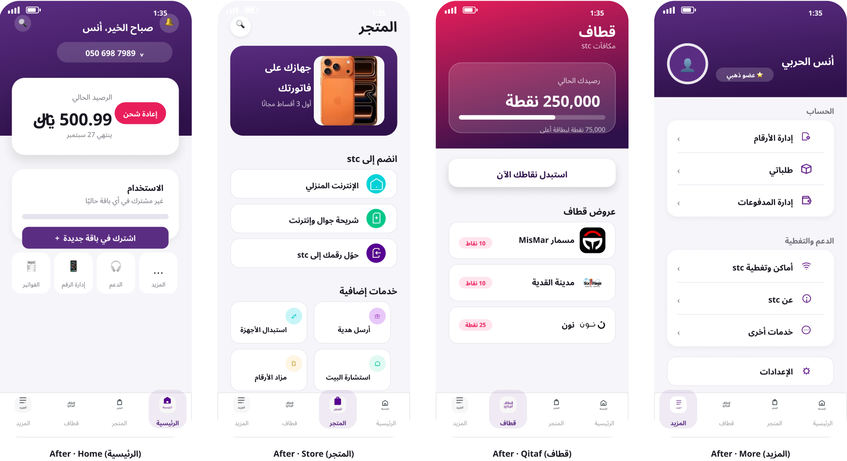
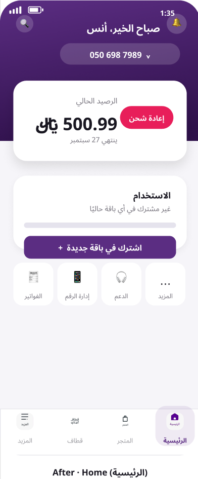
Home: greeting, balance, one next step
Personalized hello, the active number, a single balance card with recharge, then one subscribe button. Bills, manage number, and support sit as quiet quick links, not a second hero.
- Before
- Offers, Qitaf, new items, a session alert, and balance all competing in the first scroll.
- After
- Balance is the subject. Recharge and subscribe are the only loud actions.
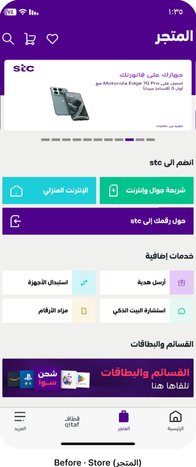
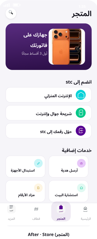
Store: join stc, then extras
A device offer still leads, that's merchandising, and it belongs here. Under it, three clear join paths (home internet, mobile SIM, number transfer), then a 2×2 of extra services. No rainbow of unrelated button colors.
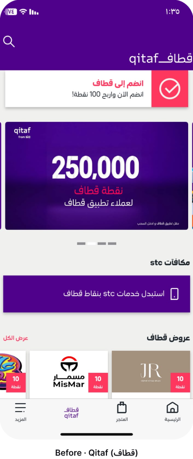
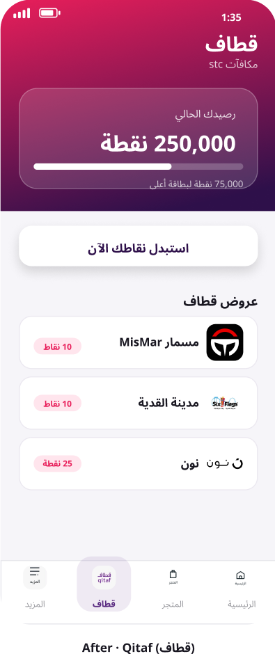
Qitaf: points, progress, redeem
The points card now includes a membership-tier bar. One button: redeem. Partner offers sit below as a list, not a poster stack.
- Before
- A join banner, a big number, then more banners.
- After
- You can see how many points you have, how close the next tier is, and what to tap.
More: account, support, settings
A name and a membership badge at the top, then grouped lists. Settings is its own row so it stops hiding inside "other services."
Outcome
Balance leads Home. Store has one join path language. Qitaf shows points, a tier, and one redeem. More groups account, support, and settings.
A high-fidelity concept in Figma, four screens, each with one job.
Reflection
What I'd do next
- In production, campaigns would sit in one promo module so Home keeps a single job.
- This Home is prepaid-first. A number that already has a package should lead with usage, not "subscribe."
Key learning
Telecom apps accumulate campaigns until Home loses a single job. The work was choosing what leads, then making that choice obvious.
Other projects
Got something like this to design?
I'd rather talk it through than read a brief.