Case Study · 01 / 03
Rebuilding Haraj around the listing, not the list
Saudi Arabia's biggest classifieds app. The opportunity is making listings scannable in a few seconds.
Context
A marketplace people already trust, with an interface that still asks you to read, not scan
Haraj is how a huge part of Saudi buys and sells used cars, phones, furniture, and almost everything else. The product's job is simple: help someone find a listing, judge it in a few seconds, and message the seller.
The live app still treats that job like a long document. Listings are rows. Search is a text dump. Adding something to sell is a tiny plus in the header. I designed this independently in Figma, from the live app, so the before is recognizable and the after is easy to judge.
As the designer on this, I:
- Audited the live Home, Search, More, and Notifications screens, tap by tap
- Mapped what a buyer actually needs on each screen versus what currently occupies the space
- Redesigned the four core screens in Figma, keeping Haraj's dark theme and blue so it still feels like the same product
- Kept the existing information architecture, this is a hierarchy problem, not a new-app problem
The Problem
The inventory is there. The scan path isn't.
-
Listings you have to read, not scan
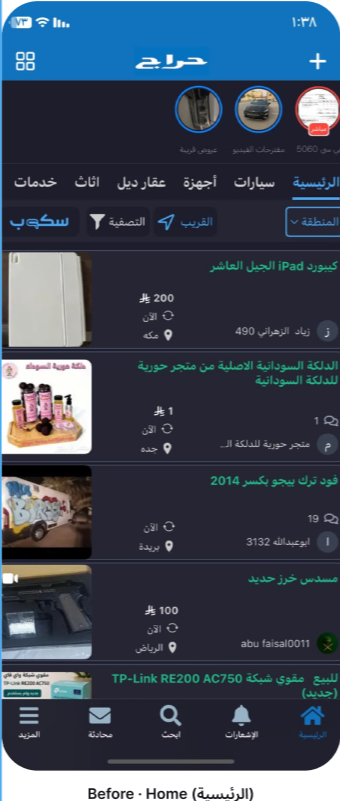
Home is a vertical stack of thumbnail-plus-text rows. Price, photo, location, and timestamp all fight at the same size. On a marketplace, the photo and the price are the decision, they should lead.
-
Search is a wall of words
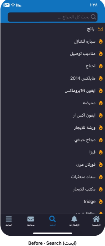
The search screen is a long list of trending queries with almost no hierarchy. "iPhone 16 Pro Max" and a vague one-word query sit at the same visual weight. Nothing tells you what's actually moving right now.
-
Selling is hidden; empty states do nothing
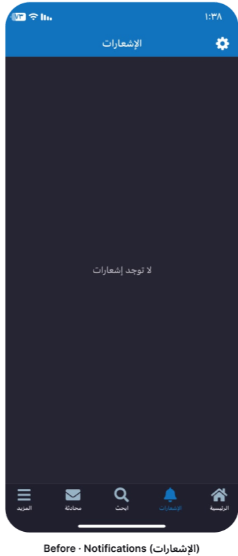
Adding a listing is a small plus in the header, easy to miss if you're a first-time seller. Notifications, when empty, is just a sentence. No reason to turn them on, no picture of what you'd get.
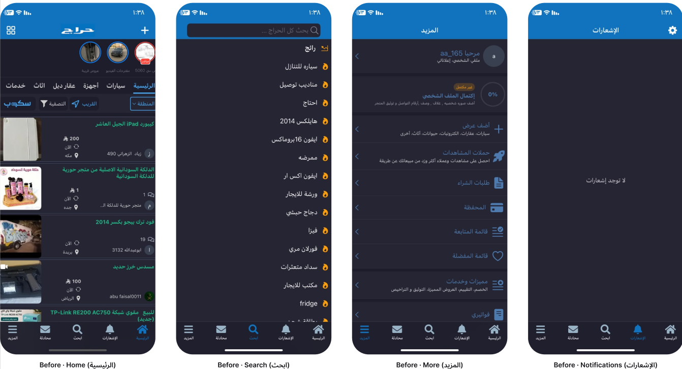
Before, the live app, same four screens
Insights
What a close audit of the live app made clear
A screen-by-screen audit of the live app: where the scan path breaks, and what a buyer needs on each screen.
Price and photo are the product
On Haraj, people don't browse brands. They scan for "is this the thing, at a price I'll consider, near me?" A row that leads with a timestamp is answering the wrong question first.
Search is hunting, not browsing
Haraj isn't a storefront you wander. People arrive with a query. Ranking what's being searched right now, cars, drivers, a specific phone, is more useful than a flat history list.
A 0% complete profile is a design problem
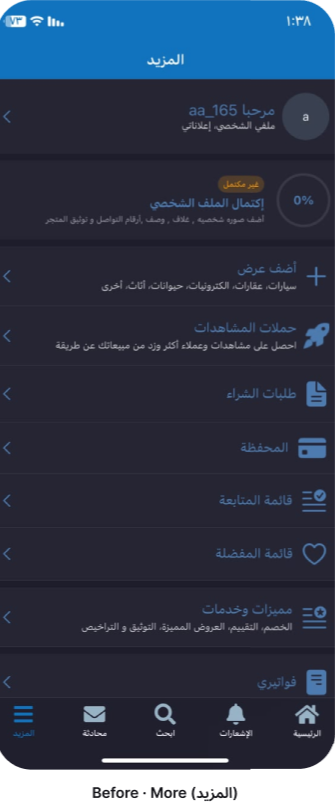
The More screen already shows a profile completion ring sitting at zero. That's a signal the prompt isn't doing its job. Completing a profile has to look like a task, not a leftover widget.
Empty states should ask for something
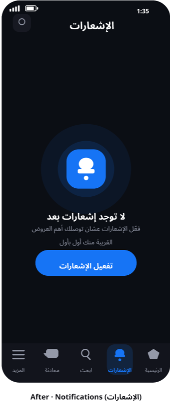
An empty notifications screen that only says "no notifications" is a dead end. The useful version explains why you'd turn them on, then gives you the button to do it.
Process
From the live app to four Figma screens
Solution
Four screens, one rule: the listing is the unit
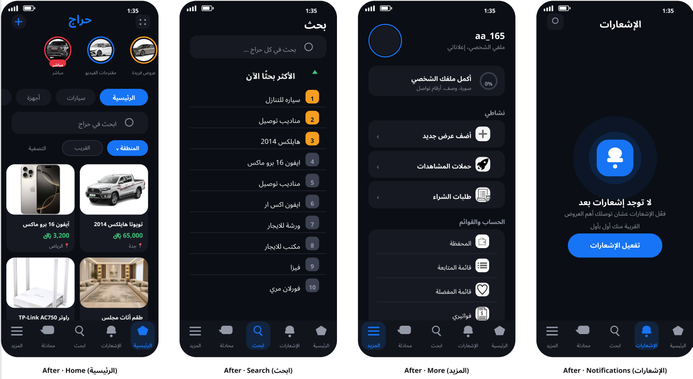
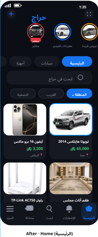
Home: a grid you can scan
Two-column cards. Photo first, price in green, location underneath. Category chips and a search field sit above the feed so you can filter without leaving Home.
- Before
- Thumbnail-plus-text rows. Price, photo, and timestamp at the same weight.
- After
- Card grid. Photo and price lead. Location is a tag, not a paragraph.
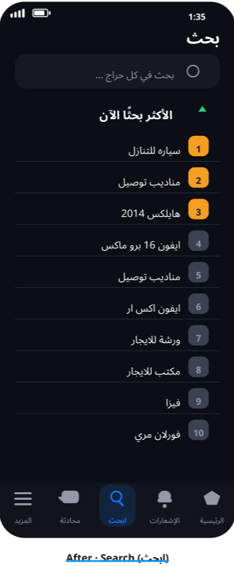
Search: ranked, not dumped
"Most searched now" as a numbered 1–10 list. The number is the hierarchy. You can see what's moving without reading every line.
- Before
- A long unranked list of queries, some with a small fire icon.
- After
- Numbered ranking. The thing people are hunting today is obvious in one glance.
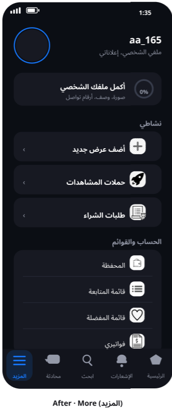
More: a dashboard, not a dump
Profile completion is a card with a task, not a leftover ring. Activity and account tools are grouped so "add a listing" isn't competing with invoices.
Notifications: an empty state that asks
A bell, a reason ("so you get the offers near you first"), and a primary button to turn them on. The screen now has a job even when it's empty.
Outcome
Home is a card grid. Search is numbered 1–10. More groups the tools. Notifications asks you to turn them on.
A high-fidelity concept in Figma, four screens that make the listing the unit of the product.
Reflection
What I'd do next
- Test the Home grid with people who sell on Haraj, then take the same system through listing detail and chat.
- Keep photo and price first on every surface that shows a listing, the scan path has to stay consistent.
Key learning
Keeping Haraj's dark theme and blue kept the product recognizable. The work was making the same product scannable: photo and price first.
Other projects
Got something like this to design?
I'd rather talk it through than read a brief.